
Dale Wagler on Designing Intuitive User Experiences
by Dale Wagler
As we celebrate 10 years of Helix, we’re taking a look at the design thinking and innovation that helped shape its evolution. Dale Wagler, Manager of Product Design at Line 6, shares how user experience, color standards, and intuitive workflows became foundational to the Helix ecosystem—and how it all started nearly two decades ago with the M13.
Hi, my name is Dale Wagler. I’m the Manager of Product Design here at Line 6.
So UI/UX, or user interface/user experience—what makes that good design? A big part of that is discoverability. You want to be able to find the features that you want to access quickly, without having to think about it. They should be right at your fingertips.
You want to be able to work with a unit about as quickly as you can think of things that you want to do. And whenever possible, we like to add maybe a feature here or there that people don’t know they need until they happen upon it. That’s part of the discoverability, and that’s what makes using something like Helix really exciting—because you find a new workflow that you didn’t even know was possible. That leads you to all kinds of new sonic possibilities, and it kind of opens up that creative space.
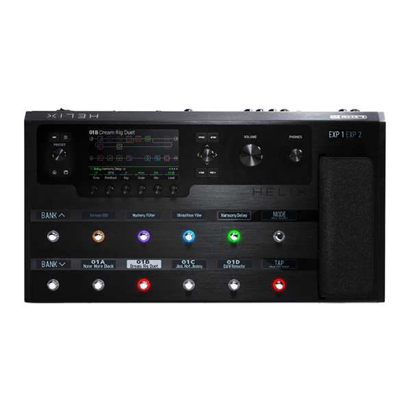
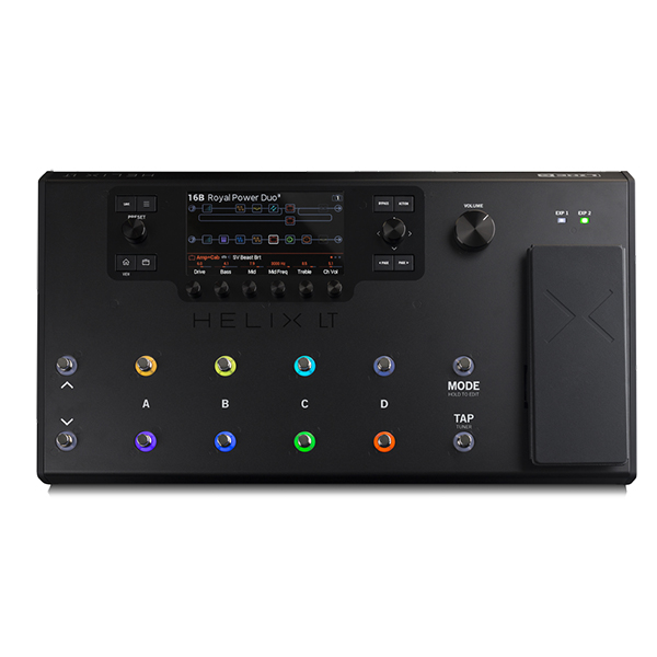
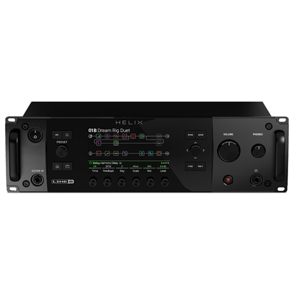
Anyone that’s familiar with Helix or the HX Edit platform is no doubt familiar with the signal flow view and knows, at this point intuitively, when they see a green block, that’s a delay block. They see a yellow block—they know that that’s a distortion. Blue is a modulation, purple is filter, orange is reverb. These are kind of established things in our ecosystem. But they weren’t always that way.
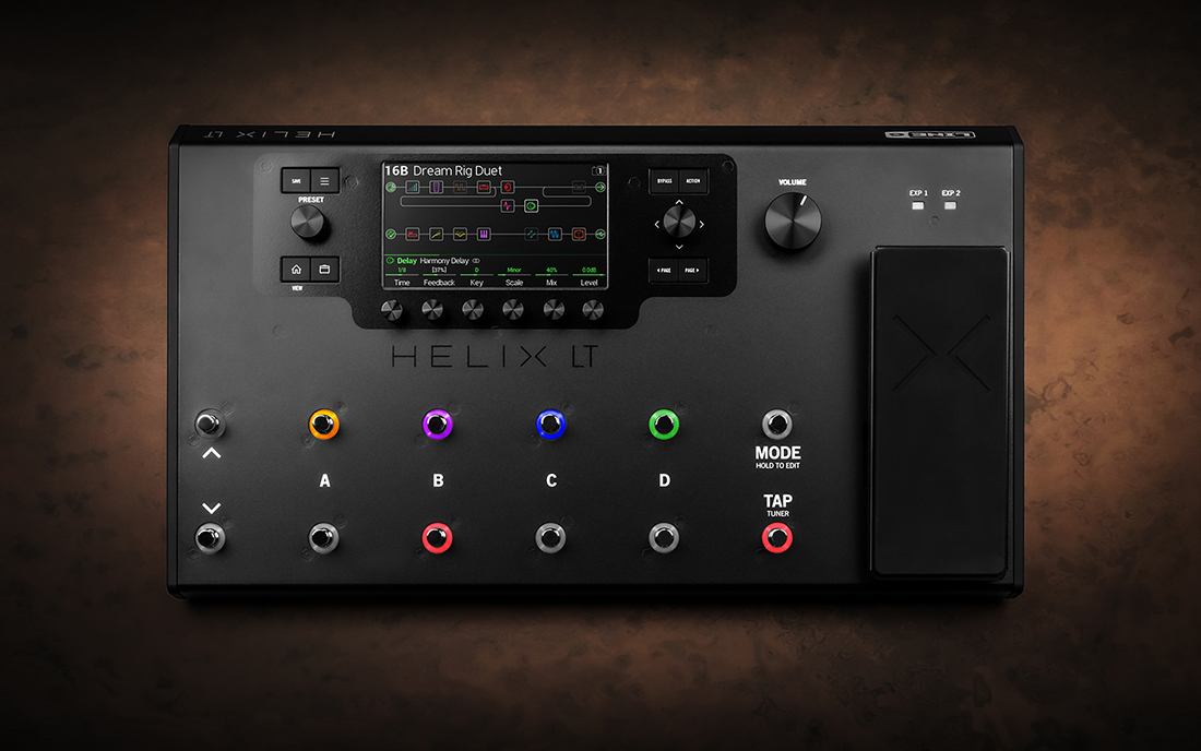
In fact, one of my favorite projects that brought that to light was the M-Series, which started with the M13. I think we started development on that in 2005 or 2006. Prior to M13, there was no color standard, and we in fact struggled with the user interface of that product, trying to figure out—you had four blocks of effects that were available, each block had three potential effects you could activate, and they could be anything. So how did we let the user know what they had on deck?
We backlit the LCD display above each block, as all were back then, just with a white LED. I had asked the question, “Well, could we use an RGB LED to backlight the display?” It turned out we could, and we could use RGB LEDs in the footswitches. So we came up with the idea of a dim state for effects that were off and a bright state when it was on—but using RGB to colorize them and colorize the display. So whatever your active display was, that backlight color matched the active effect type.
Then we just had to come up with—well, what colors do we use? It turns out we had those colors already established, in a sense, from earlier products—the 4×4 pedal series, which was the DL4, the DM4, the MM4, and the FM4. But we still had to educate the user what those colors meant.
So on each of the M-Series pedals, we had to silk screen on the name of the product, and then in those colors, we made kind of a map key—where “Delay” was printed on it in green, “Modulation” was printed on it in blue, etc.
And now here we are nearly 20 years later, and it’s ubiquitous with our ecosystem. People just know green is delay. And that’s really the essence of good, deep user experience—understanding how to put those fundamental things in place, and then building on it over generations.
I think that’s something that we’ve achieved that is pretty spectacular.


Leave a Reply
You must be logged in to post a comment.